EXPANSE
Beyond Your Limits.
A visual identity created for a modern performance brand.
Built around movement, precision, and progression.
The system combines a stripped-back wordmark, a directional symbol, and a high-contrast visual language designed to feel fast before it even moves.
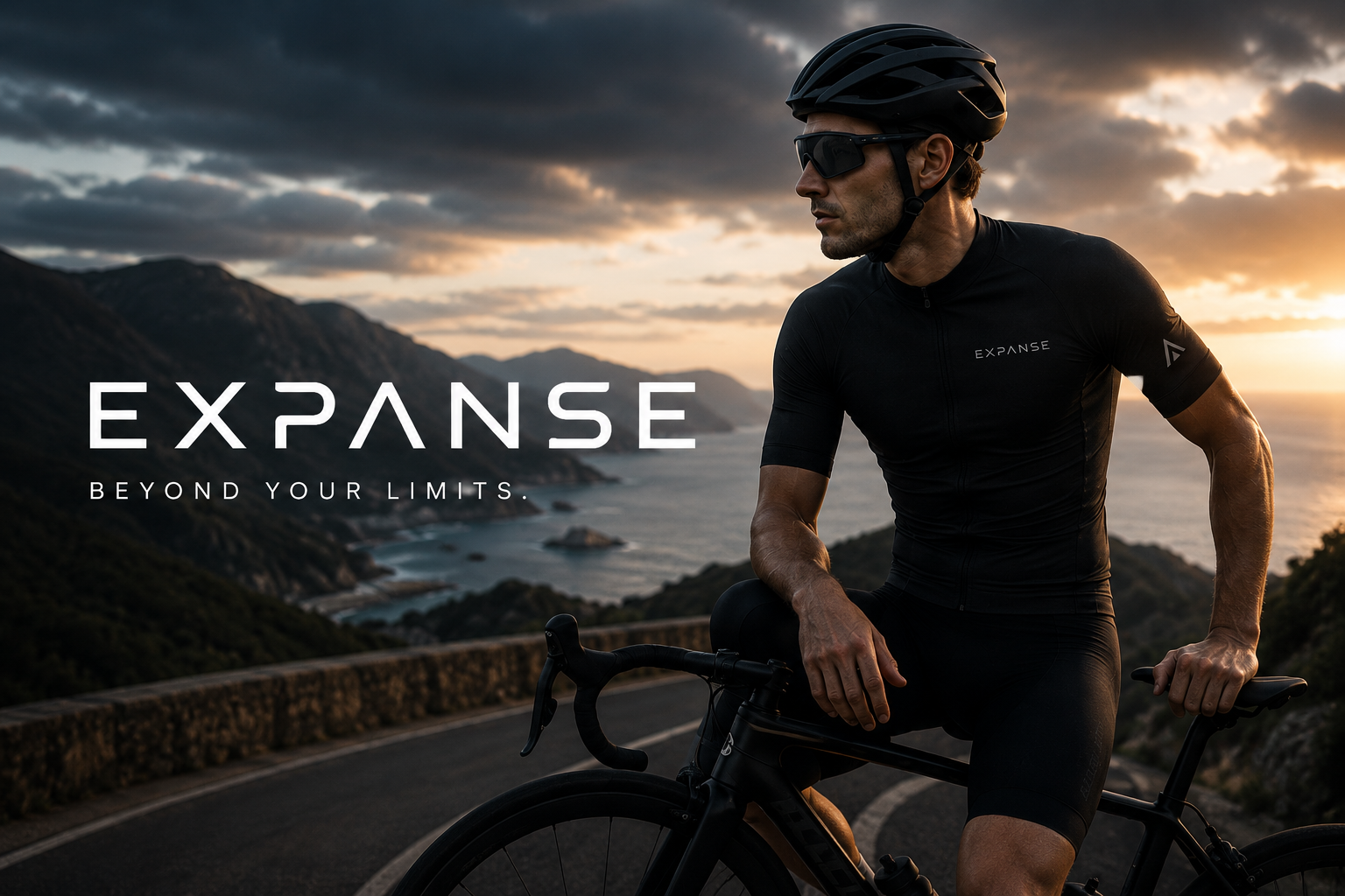
Identity System
Klawyard Studio
Overview
EXPANSE started with a simple question:
How do you make performance feel visible?
The answer became a visual system built around direction, motion, and constant progression. Every element was reduced to its most essential form—allowing the identity to move seamlessly across apparel, packaging, and campaign imagery.

A single geometric form built from upward movement.
The shape acts as a directional cue throughout the system—appearing across apparel, packaging, and digital applications.
Simple enough to scale.
Distinct enough to own.

The wordmark follows the same principle as the symbol:
Remove everything unnecessary.
Wide spacing, sharp cuts, and balanced proportions create a visual rhythm that feels calm at rest and dynamic in motion.
Typography & Colour
Satoshi was selected for its balance between technical clarity and contemporary character. Its geometry feels engineered without becoming cold—making it equally effective on apparel, packaging, and digital environments.
Nn Oo Pp Qq Rr Ss Tt Uu Vv Ww Xx Yy Zz
A deliberately restrained palette.
Electric Blue drives recognition.
Energy Orange introduces contrast.
Black and White create space for everything else.
Nothing decorative. Everything functional.
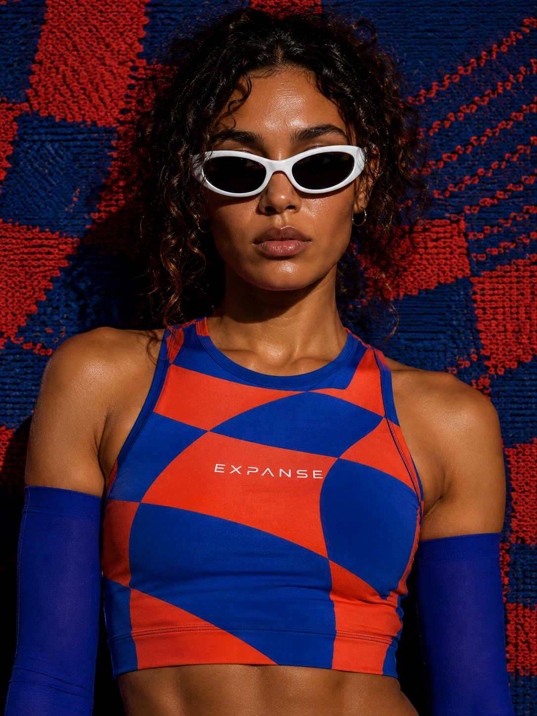
Pattern
System
The pattern began as an exploration of movement.
Curves overlap.
Forms repeat.
Momentum becomes visible.
What started as a graphic element evolved into one of the strongest recognition assets within the identity.
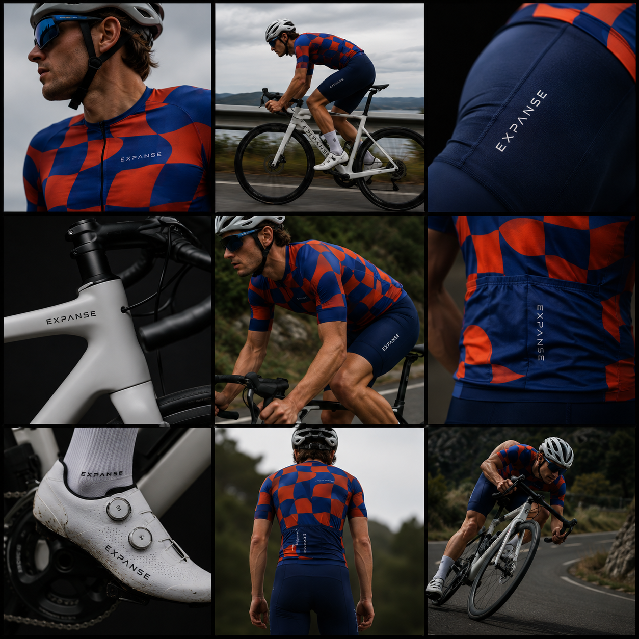
Application
Bicycles · Equipment
The identity was built to live beyond presentation boards.
From jerseys and accessories to bicycles and equipment, the system remains consistent regardless of scale.
The goal wasn't decoration. It was recognition.
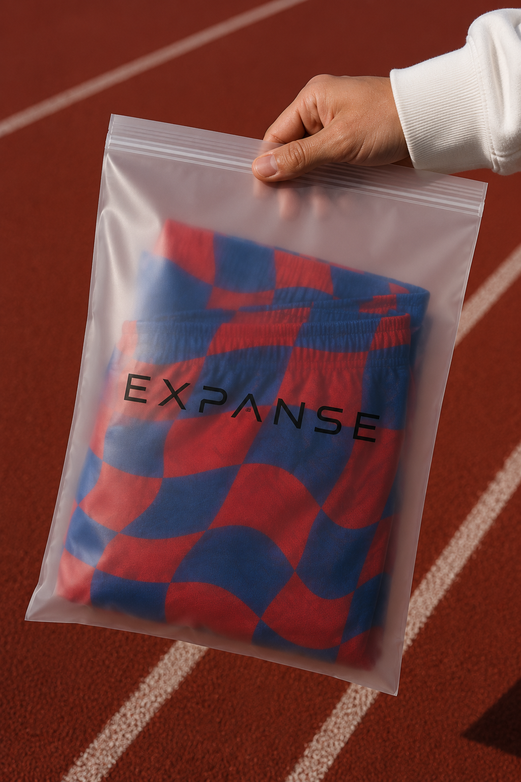
Packaging
The packaging follows the same philosophy as the rest of the system:
Remove excess.
Keep only what matters.
A simple structure, clear branding, and a strong silhouette create a packaging experience that feels intentional from first touch.
Performance
Travel · Everyday
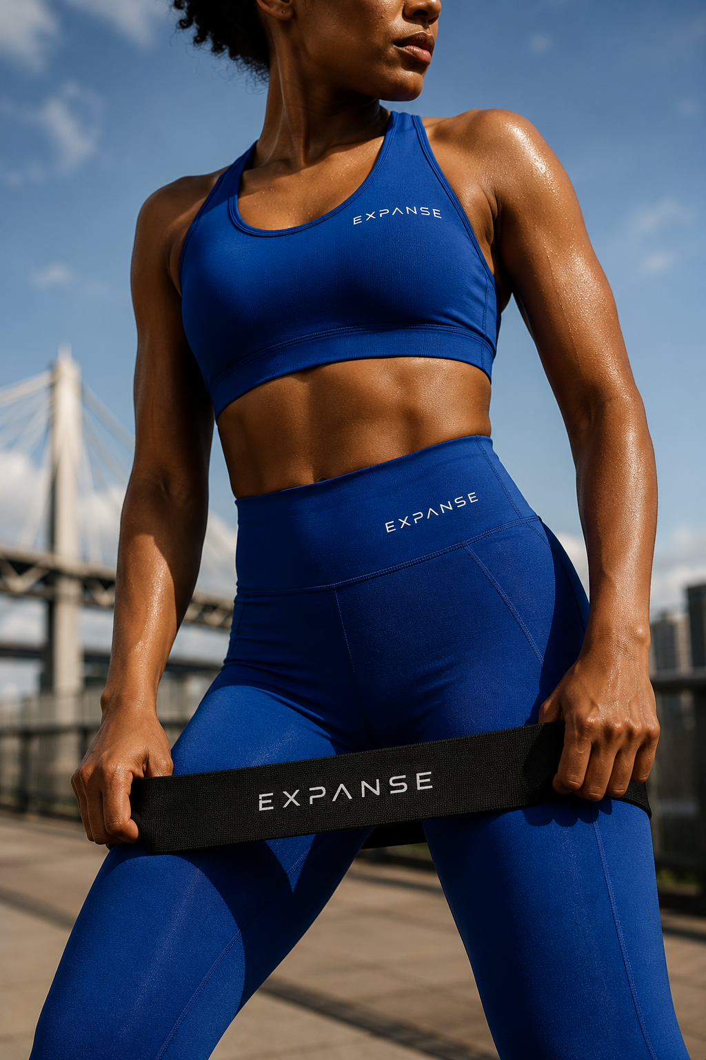
The identity wasn't designed solely for race day.
It needed to feel equally comfortable in training, recovery, travel, and everyday movement.
A performance brand without being trapped by performance culture.
EXPANSE
Beyond Your Limits.
A visual system built around progression.
Nothing extra.
Nothing accidental.
Just movement.
Ready to build
your brand?
Let's create an identity built to last.
Get In Touch