EVRYDAE
Elevated Essentials
EVRYDAE is a premium essentials clothing label built around timeless design, elevated basics, and everyday luxury. The identity combines bold typography with a custom infinity-inspired icon system that symbolizes continuity, longevity, and intentional design.
EVRYDAE was created to transform everyday clothing into elevated essentials.
The identity system balances luxury and accessibility through a custom wordmark, distinctive iconography, refined typography, and a minimalist visual language designed to last beyond trends.
Logo Design
Logo
Evolution
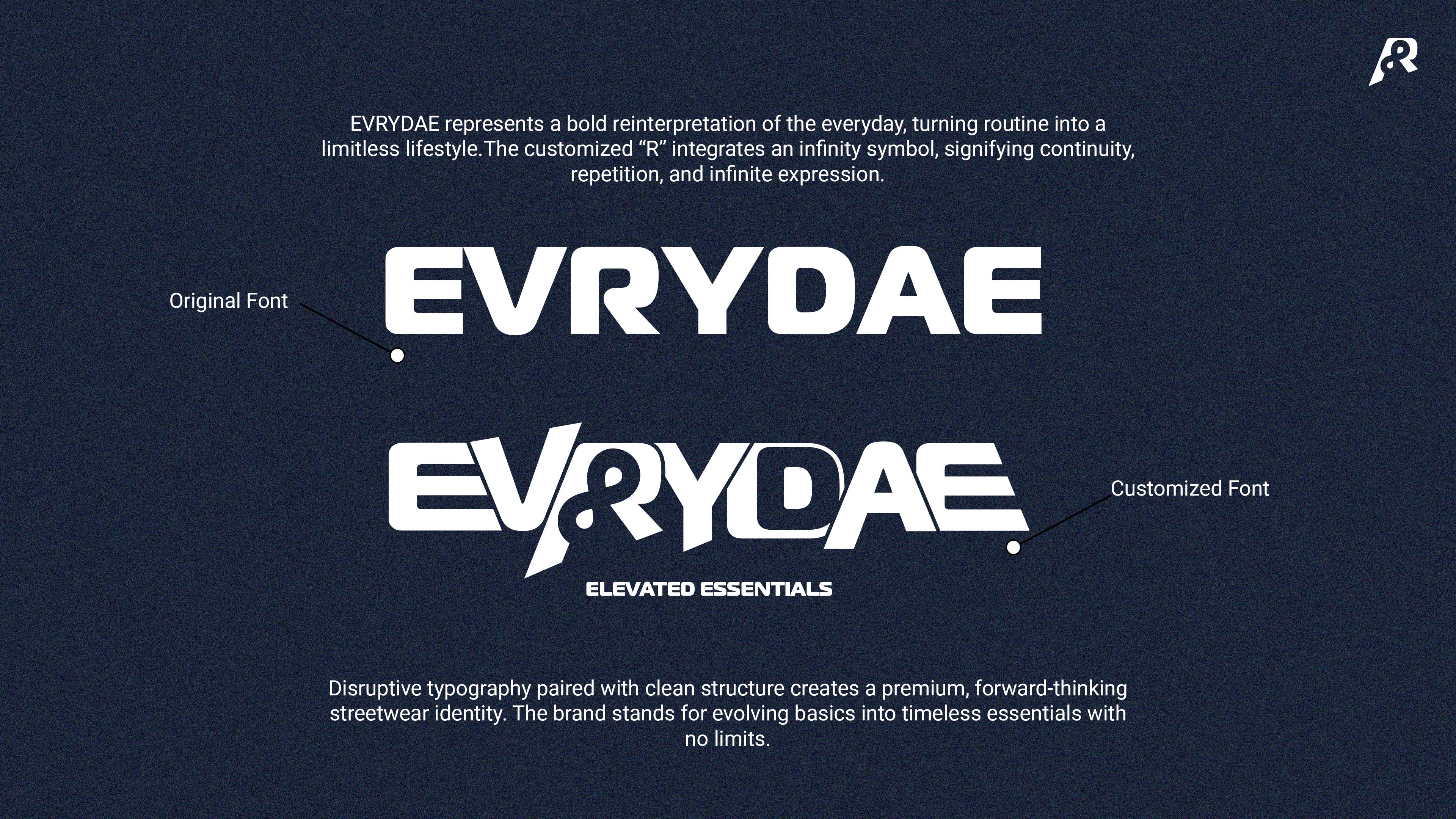
The EVRYDAE wordmark begins with a bold geometric foundation before being transformed through custom typography.
The distinctive "R" integrates an infinity-inspired structure that becomes the defining visual signature of the brand. This modification turns a simple wordmark into a memorable identity system capable of scaling across apparel, packaging, and digital experiences.
Brand Foundation
Brand
Foundation
Brand Mission
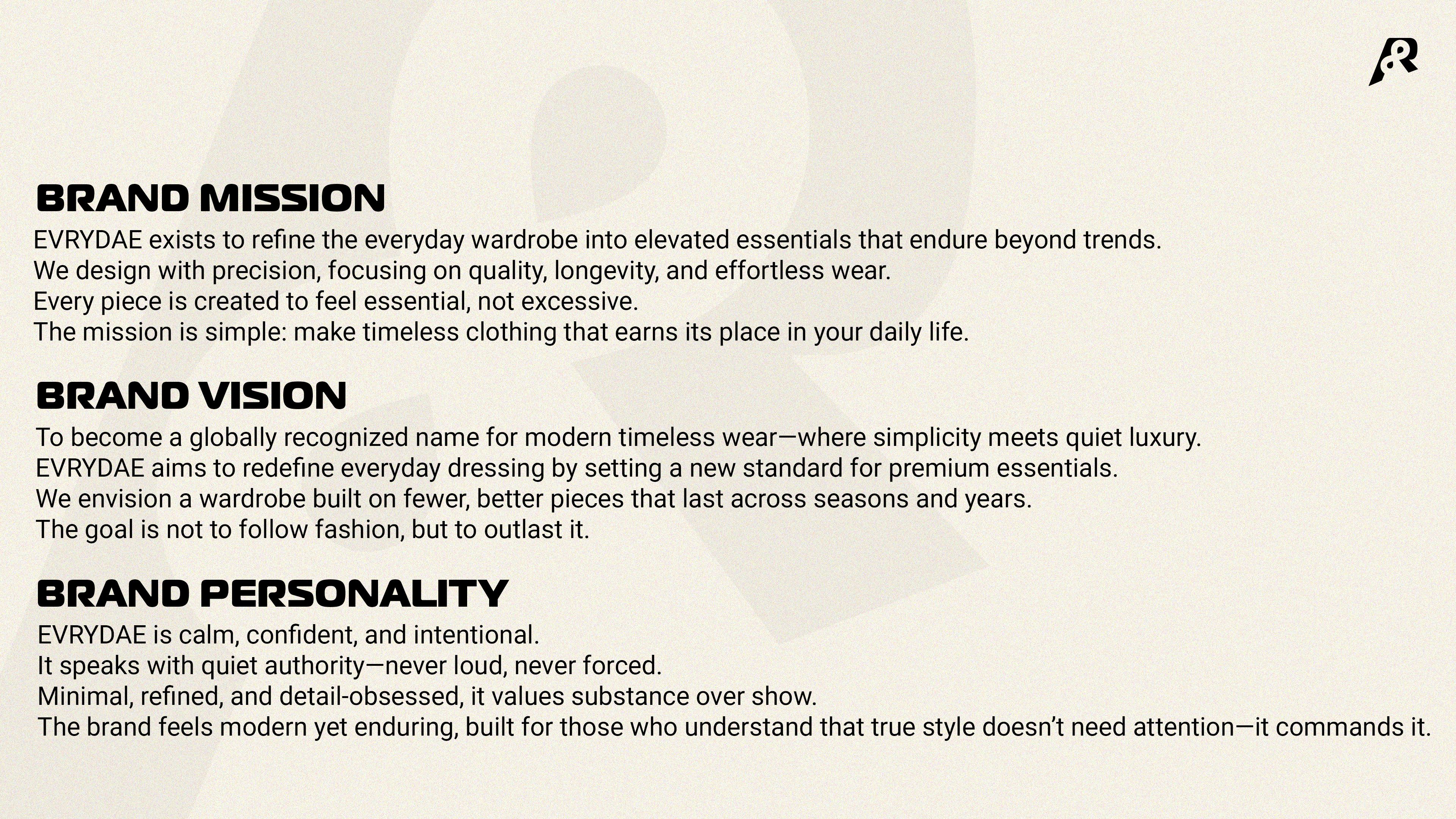
EVRYDAE exists to refine the everyday wardrobe into elevated essentials that endure beyond trends. We design with precision, focusing on quality, longevity, and effortless wear. Every piece is created to feel essential, not excessive.
Brand Vision
To become a globally recognized name for modern timeless wear — where simplicity meets quiet luxury. EVRYDAE aims to redefine everyday dressing by setting a new standard for premium essentials. The goal is not to follow fashion, but to outlast it.
Brand Personality
EVRYDAE is calm, confident, and intentional. It speaks with quiet authority — never loud, never forced. Minimal, refined, and detail-obsessed, it values substance over show. The brand feels modern yet enduring.
Brand Icon
The Infinity Mark
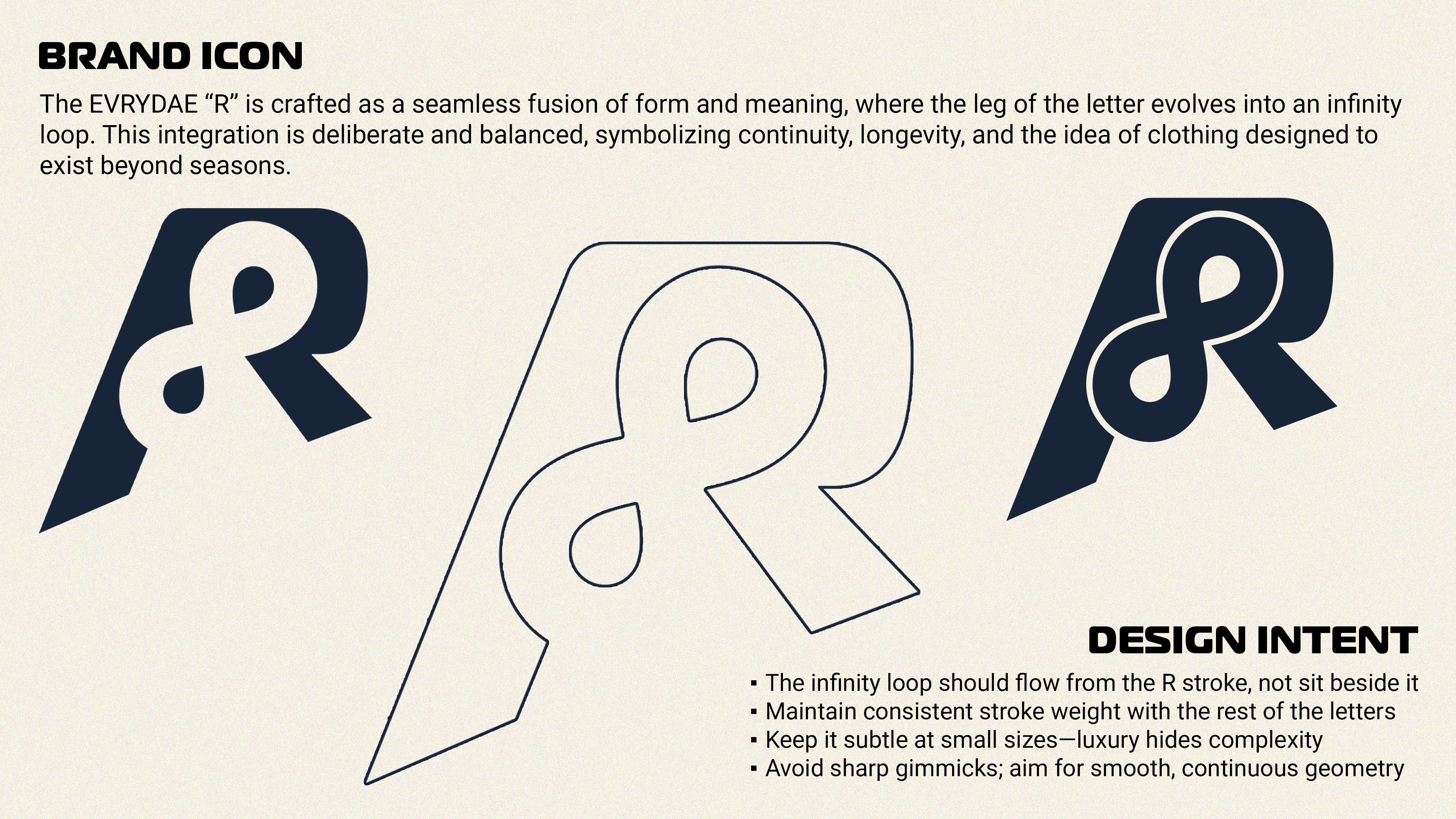
The custom icon is built by merging the letter R with an infinity-inspired loop. The result creates a distinctive visual symbol that communicates continuity, longevity, and timeless design. This icon serves as the core recognition element across packaging, apparel, and brand communications.
Color System
Color
Strategy
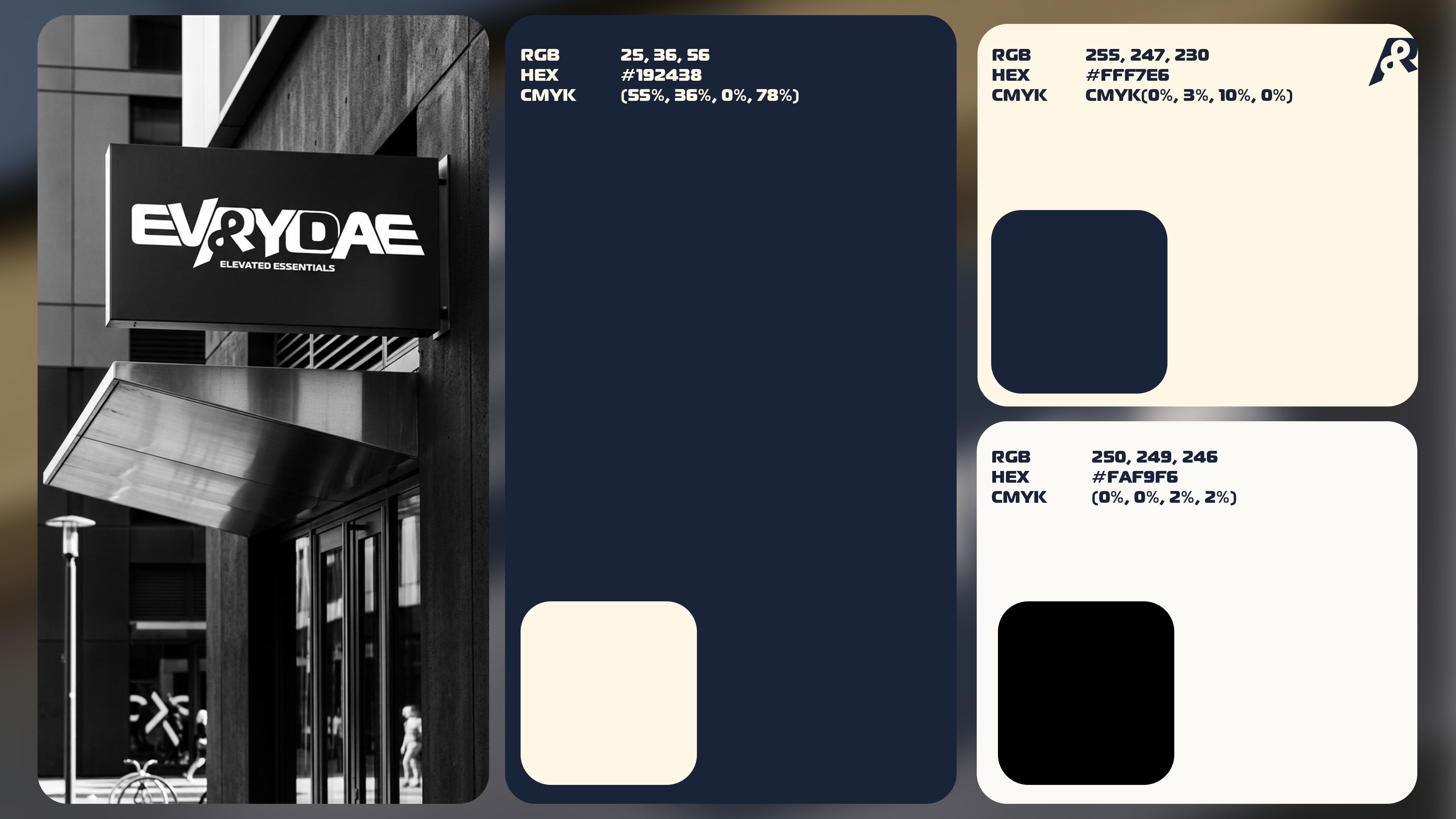
The EVRYDAE palette combines deep navy, warm ivory, and neutral tones to create a premium visual environment. The system was designed to feel timeless, sophisticated, and adaptable across fashion, print, packaging, and digital applications.
Typography
Typography
System
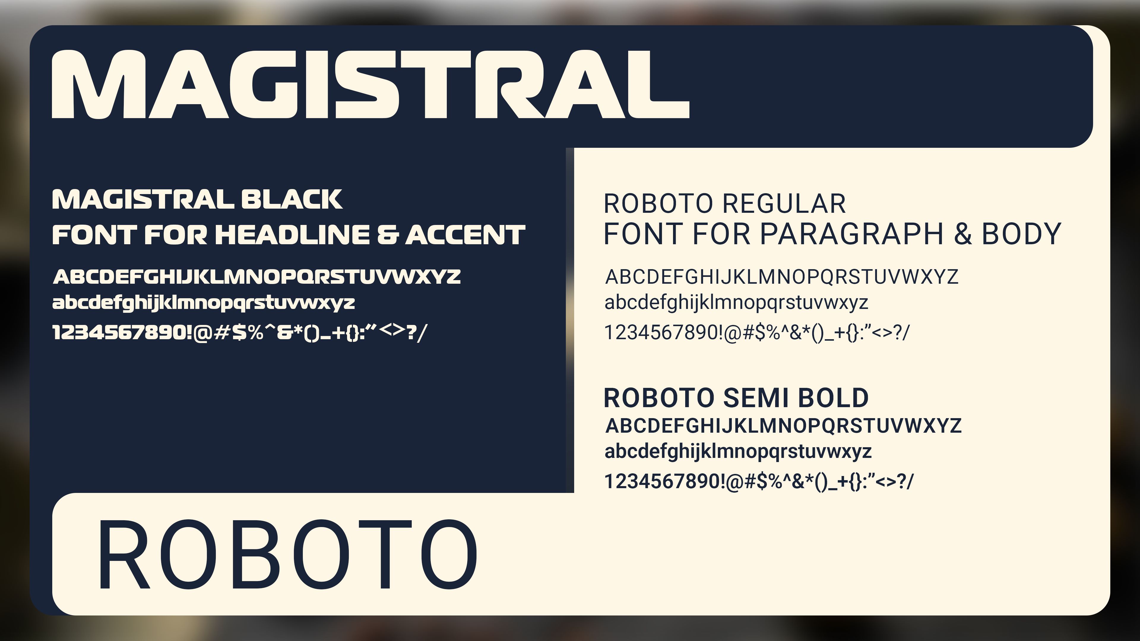
Magistral Black forms the foundation of the visual identity, delivering strength and memorability in headlines. Roboto supports the system with clarity and readability, ensuring consistency across brand communications. Together they balance character and functionality.
Packaging
Packaging
Experience
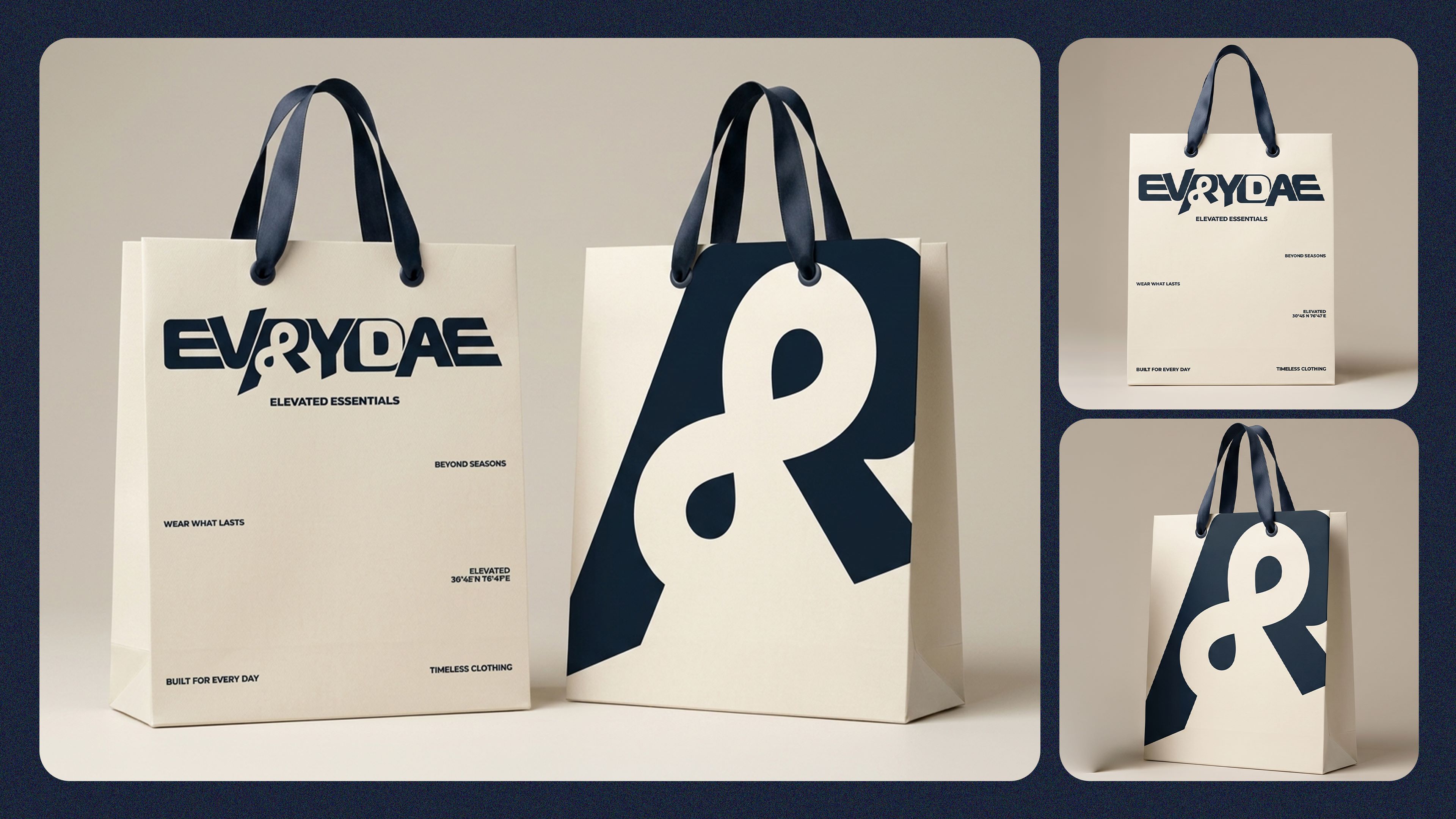
The packaging system extends the brand identity into a tactile experience. Minimal layouts, oversized iconography, and restrained typography create a luxury retail presentation that feels both contemporary and timeless.
Customer Experience
Thank You
Card
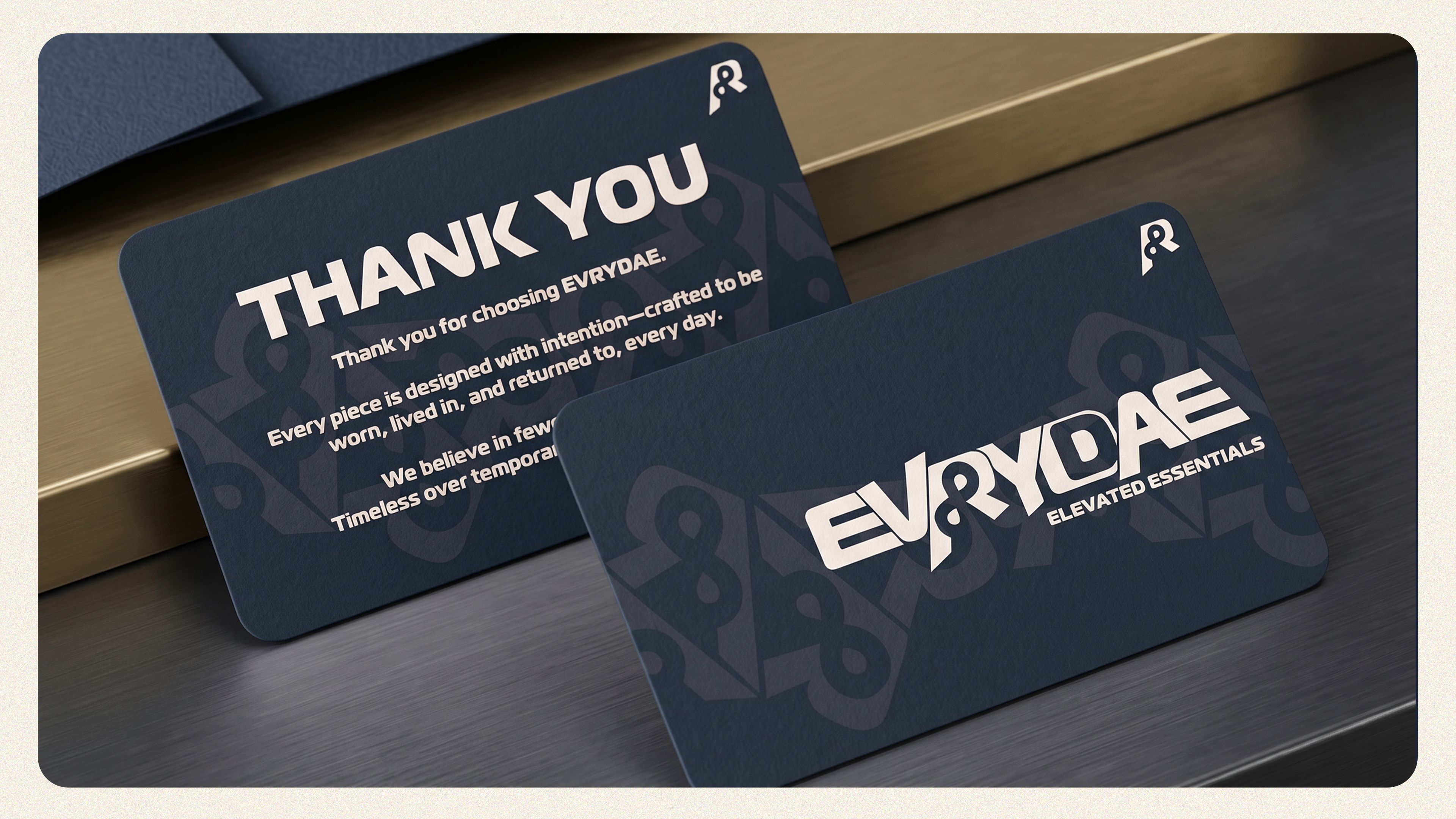
Every touchpoint reinforces the EVRYDAE philosophy. The thank-you card creates a meaningful post-purchase interaction while maintaining consistency with the broader identity system.
Product Identification
Hang Tags
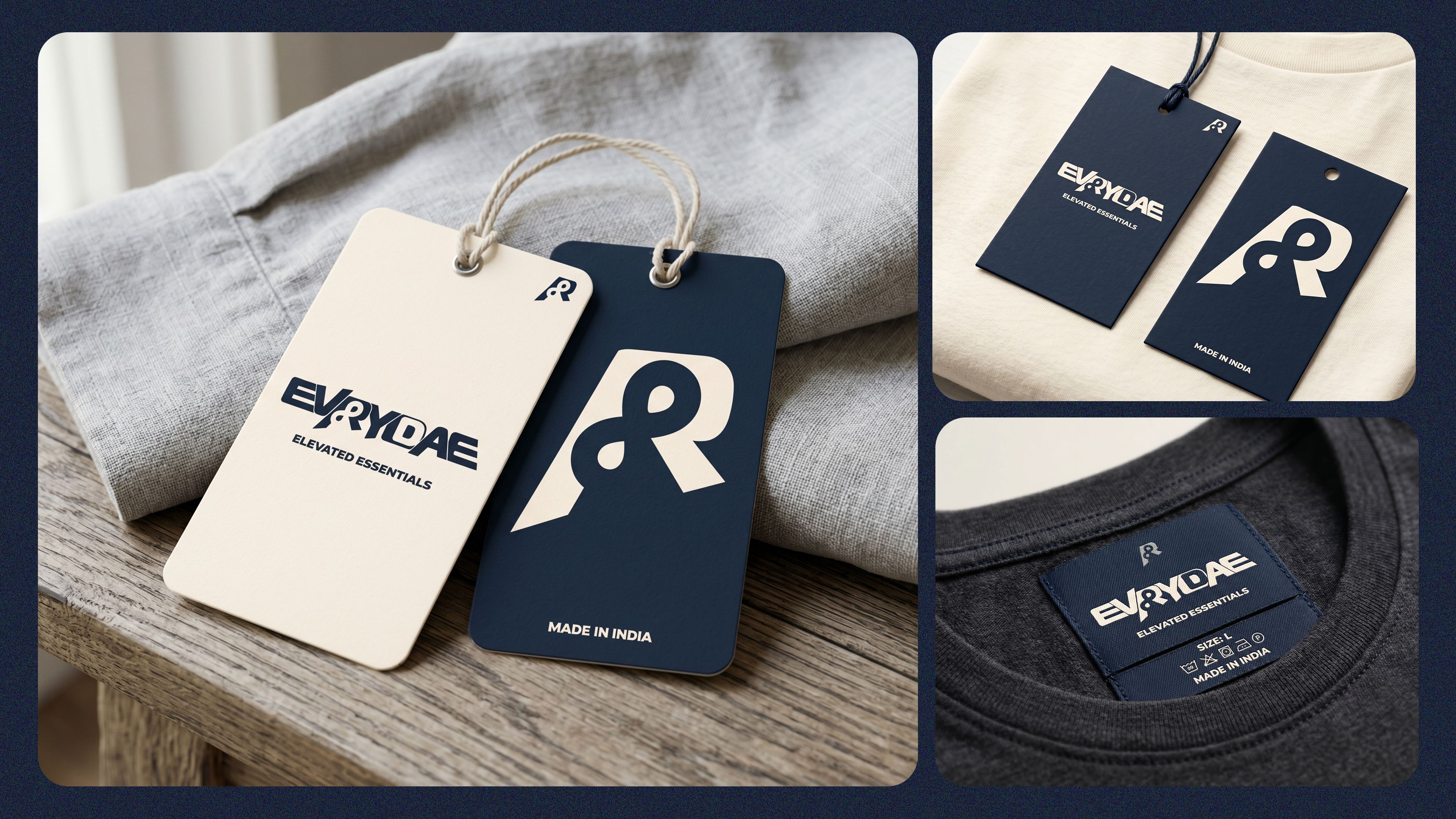
The hang tag system combines functionality with branding. Using the custom icon and wordmark, each tag becomes an extension of the premium product experience.
Fashion Application
On Apparel
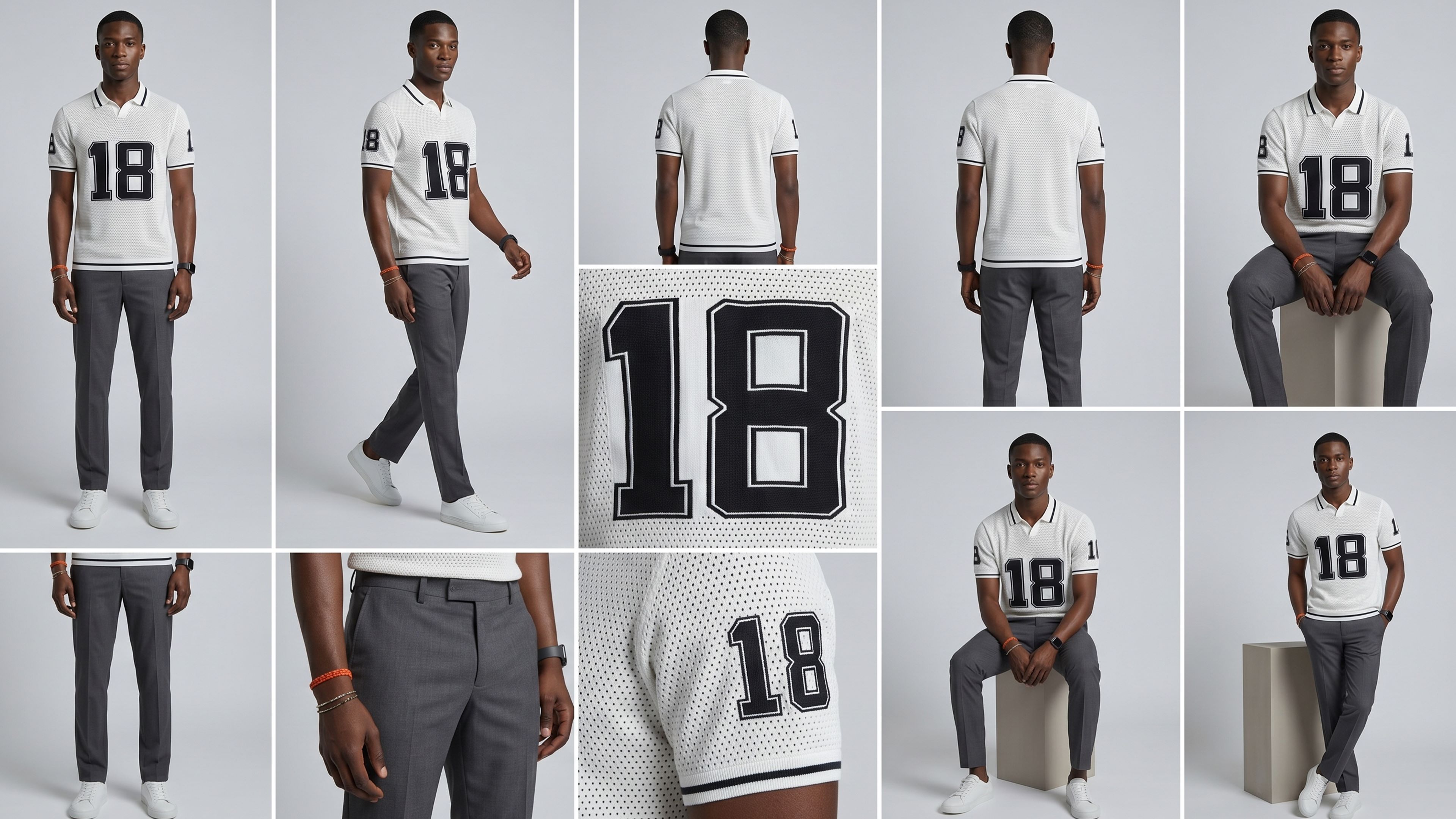
The identity was designed to live naturally on apparel. The visual language scales seamlessly across garments, labels, tags, and product graphics while maintaining a strong and recognizable presence.
Brand Touchpoints
Business
Card
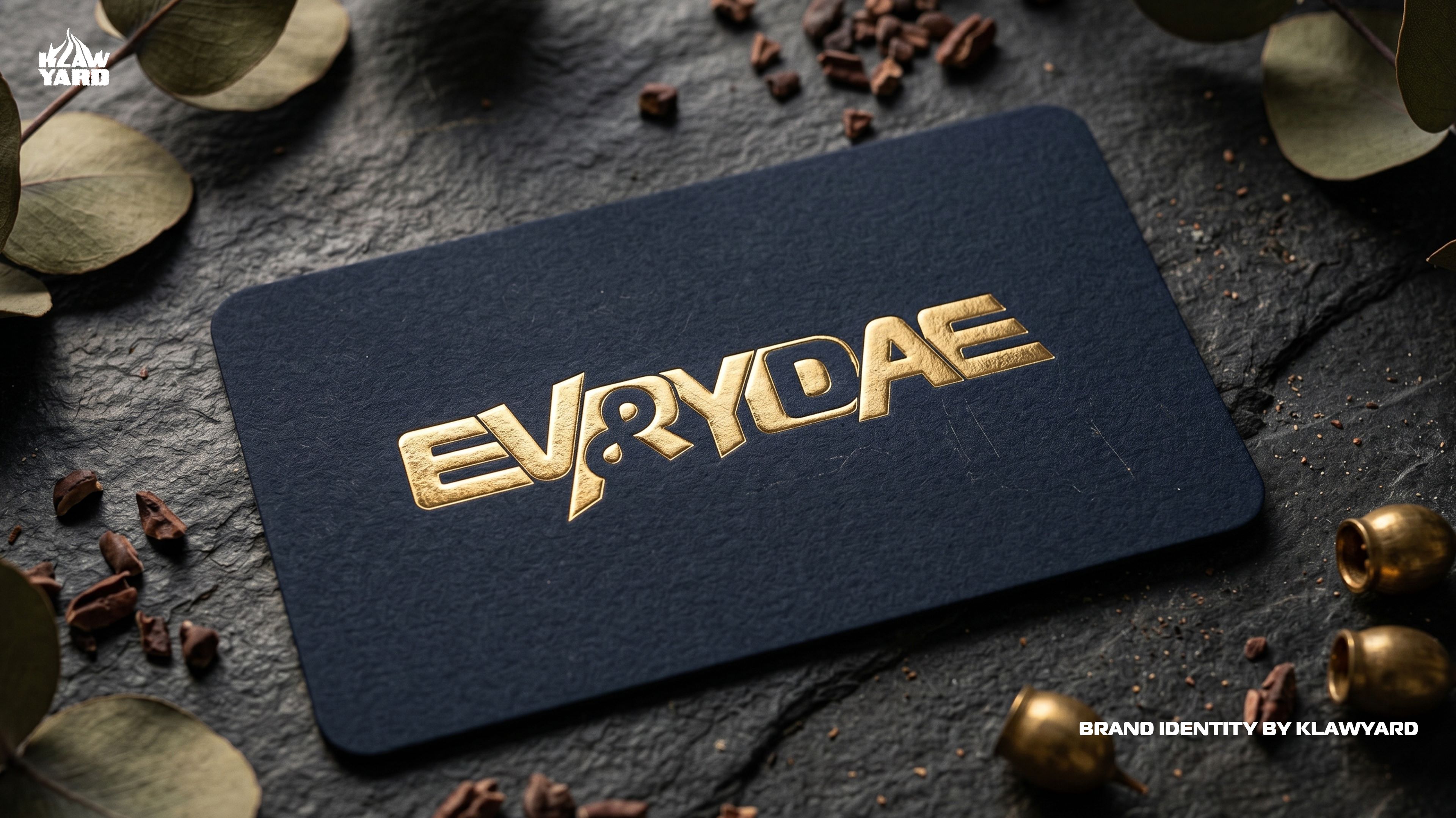
From packaging to stationery, every application follows a consistent visual framework. The result is a cohesive brand ecosystem that reinforces recognition and elevates perceived value at every interaction.
EVRYDAE
Designed Beyond Seasons.
Ready to build
your brand?
Let's create a visual identity that lasts beyond seasons.
Get In Touch